Dashboard
The dashboard is the home page of your workspace, showing pipeline health and recent activity at a glance.
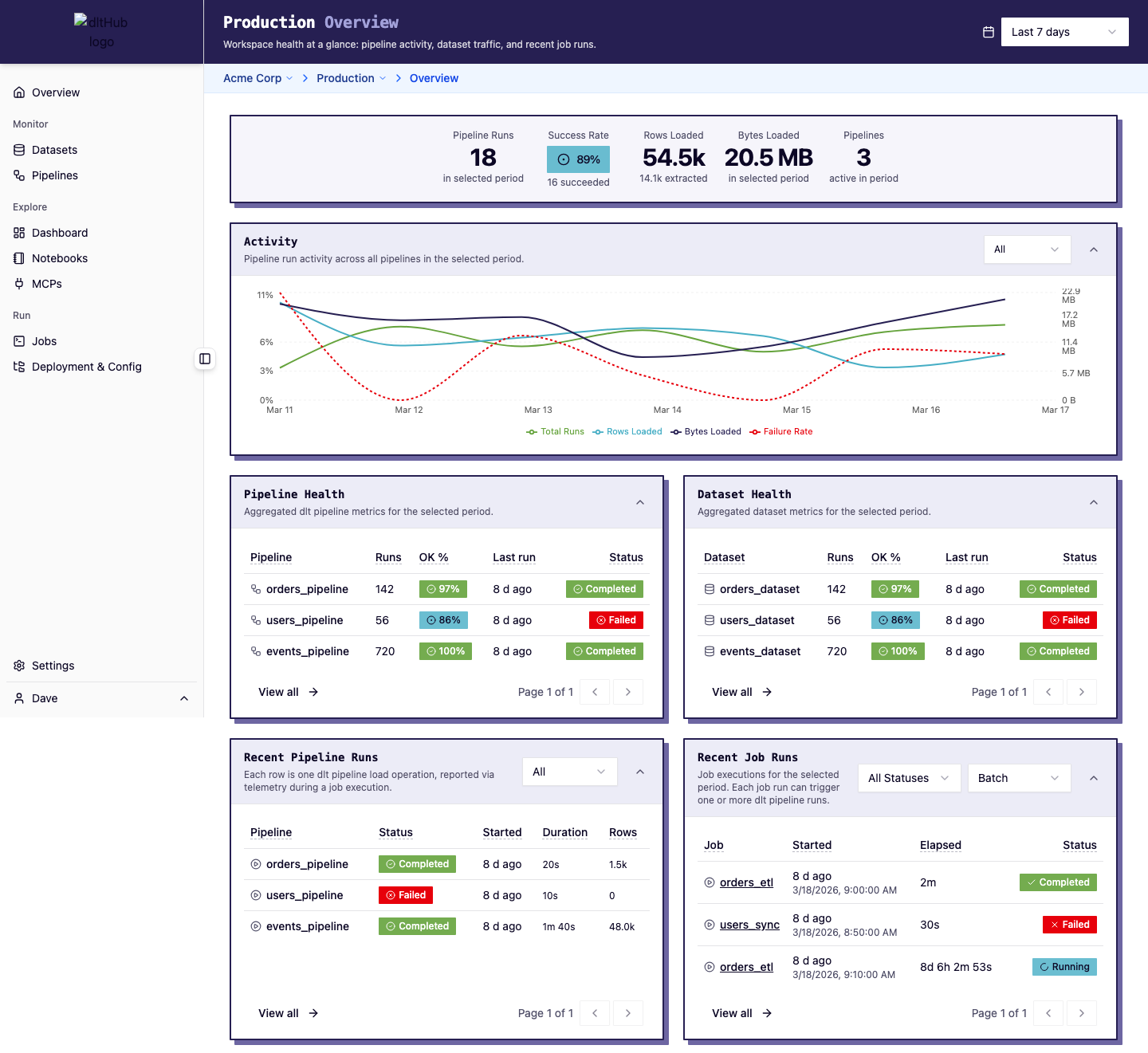
Hero stats
A stats bar at the top shows key workspace metrics for the selected time range: pipeline run count, success rate, rows loaded, and more.
Telemetry chart
Below the stats, a time-series chart visualizes pipeline activity trends. Toggle between views (All, Runs, Rows, Bytes, Duration) to focus on specific metrics. The chart auto-buckets by hour, day, week, or month depending on the time range.
Activity panels
The dashboard displays four panels in a 2x2 grid:
| Panel | What it shows |
|---|---|
| Pipelines | Compact list of your dlt pipelines with health metrics. Click a row to go to the pipeline detail. |
| Datasets | Compact list of datasets with load status. Click to see dataset details. |
| Pipeline Runs | Recent dlt pipeline executions with status, rows loaded, and duration. |
| Job Runs | Recent job executions with status and trigger type. Click to view run details and logs. |
Time range
Use the time range selector in the header to control the window for all stats, charts, and tables on the dashboard. The default is the last 7 days.
Quick actions
From the dashboard you can navigate to any detail page by clicking table rows. To trigger a new run or manage schedules, go to the Jobs page.